

artist’s website redesign
A website portfolio of an international renowned sculptural light artist.
The website not only showcases the artworks, but also allows the users to discover more about the concepts and sketches behind the pieces.

project overview
challenge
To redesign an artists website to become more inline with their colourful works and reflect the brand more closely.
process
Identify pain points through usability testing, surveys, interviews and user personas to gain a clear understanding of the improvements that would be most beneficial to the users. Work with high fidelity prototypes to present new ideas for further user testing and critique. Ensure all designs are accessibility tested throughout to ensure the artist information can be enjoyed by everyone.
My
ROLE
UX and UI Designer
timeline
2 months
tools
Figma, pen and paper
HYPOTHESIS
When looking for an immerse light experience from a unique artist, I want to be able to view the current exhibitions they are part of, so I can see how popular the artwork is and feel I am making a good decision to include this artist.
When looking for the next venue I could visit to view the artists work, I want to be able to see which artworks are on display without having to click every exhibitions name, so I can quickly see where my favourite piece is in the world.
When booking tickets for an exhibition, I want to be able to be able to find a link from the artists website so I can see how much tickets are and what the availability is.
When looking for a new artist I want to be able to view their portfolio, so I can find inspiration and see whether I like their work.
job stories
We believe that improving the artists website would present a more professional and modern brand.
We believe that removing unused areas of the website would present a cleaner and more elegant product.
We believe that adding more imagery would lead to more people remembering the artists work which could lead to more requests for inclusion in exhibitions.
INITIAL usability testing
1. To determine where the website is currently successful and where pain points or issues are
2. To better understand the key areas of the website that are in need of improvement
3. To discover whether there are any areas of the website that are under utilised or not required
4. To better understand the impression that the website is providing visitors of the studio and artists work.
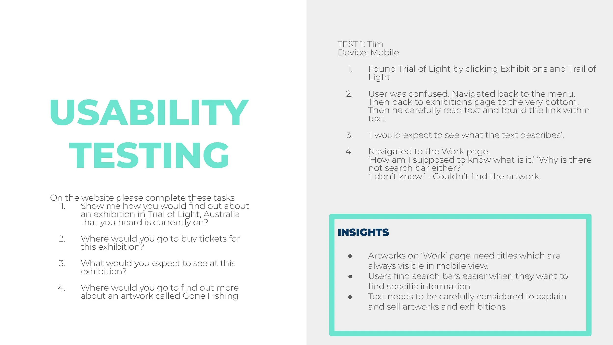
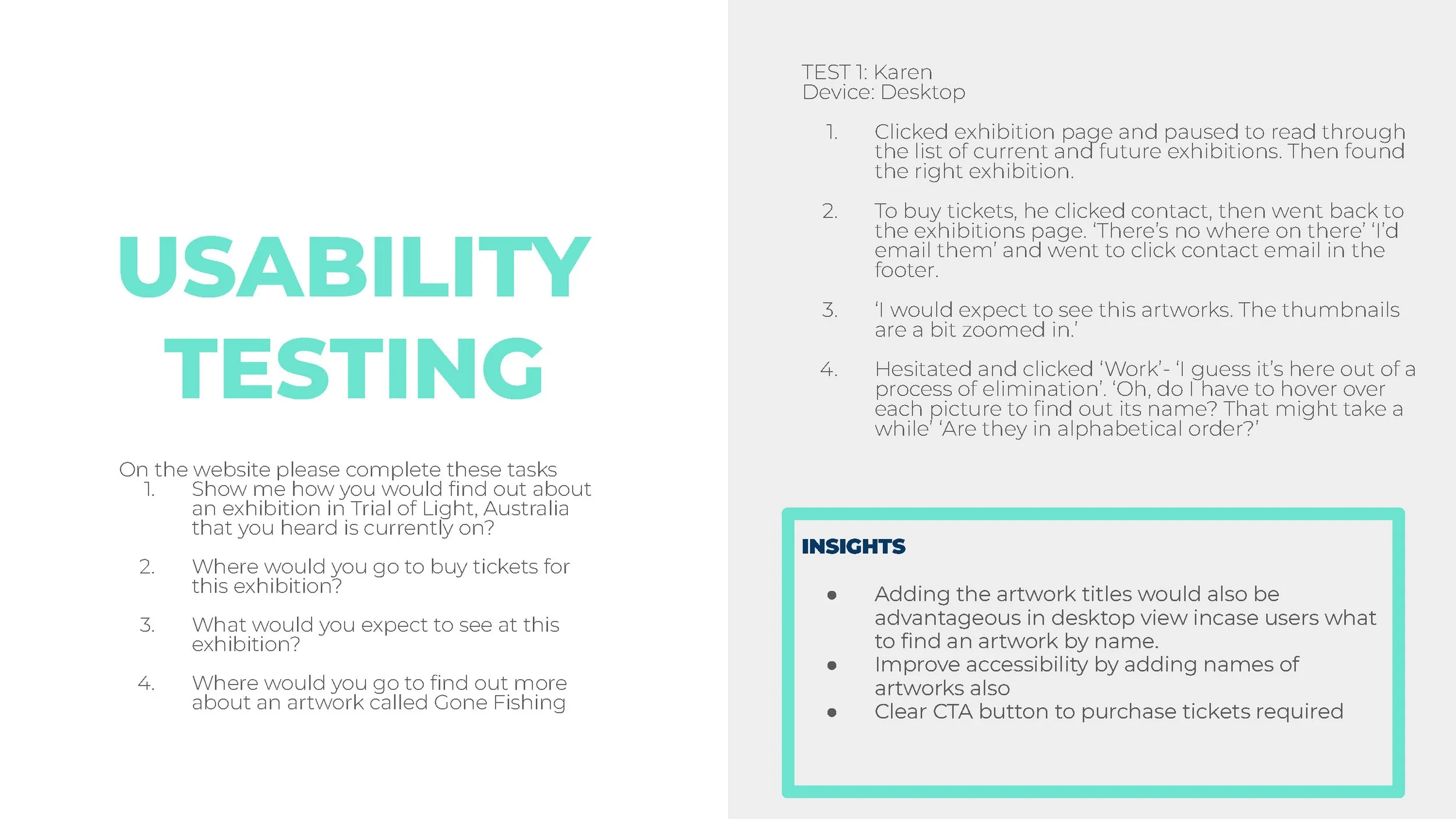
user insight
Usability testing revealed that many users do not know how to book tickets to the events. Another key pain point was identifying the names of artworks, as currently these are only revealed when hovered over with a mouse. Resulting in users using both mobile and tablet views having no way of viewing the titles.
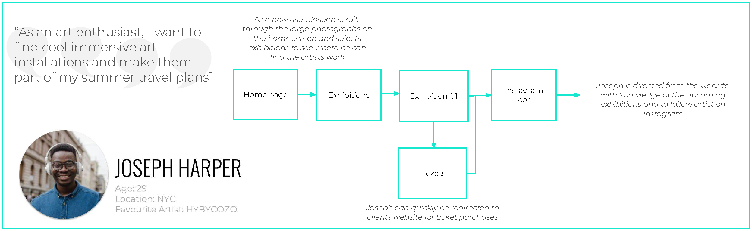
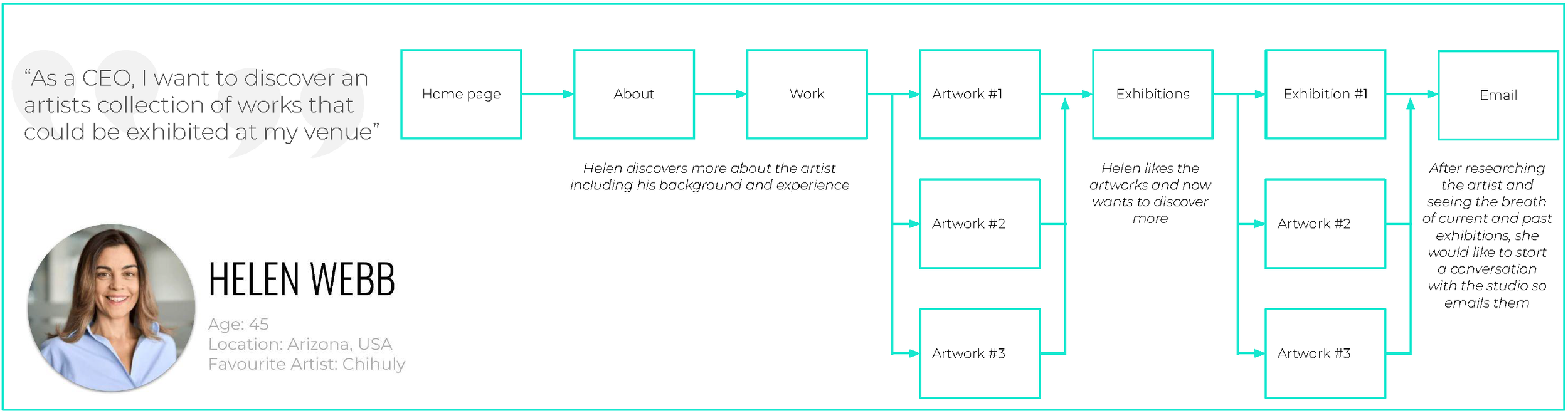
user personas
To further explore the results of my initial user testing I formed user personas from two key demographics that will be using the website.


FOCUS GROUP
I carried out a focus group with studio team members who are familiar with the website and discussed positives and negatives from their experiences.
KEY user insight #1
The exhibitions page was a key part of the discussion for the group. It is a list of current and past exhibitions with no images of artworks available to view.
Action
Fully redesign this page to include images of artworks that are at the exhibitions

key user insight #2
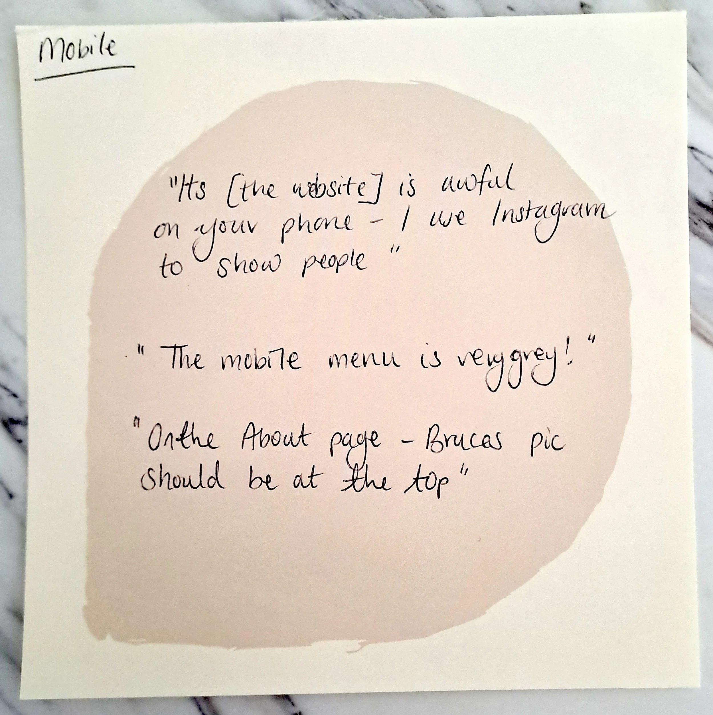
This testing highlighted ongoing issues users were finding with the mobile view. They found some information was organised in the wrong order in mobile view and that, in particular, the ‘Work’ page does not show the title of each.
Action
Ensure mobile view is testing thoroughly before launch to minimise pain points.
Contact web developer to amend coding so that the hover over text that appears in desktop view is always present in the mobile view.
Key user insight #3
The group were confused about what the News page was for as it does not get updated regularly. They discussed how social media now taken over this role.
Action
Consider deleting News page.
Ensure social links are clear and easy to access.

user insight
Website is not mobile or tablet friendly resulting in frustrated users.
Consider removing News page as it is not updated and unused.
high fidelity prototyping
With the feedback from the user testing I have carried out so far, I created a set of high fidelity prototypes using Figma.

BEFORE

AFTER
“I can’t see the names of the artworks!”
In the current mobile view the artworks names cannot be viewed until the user clicks on the thumbnails.
I darkened the images and added bold text to ensure the new titles has good accessibility and were bold and clear to all users. This design also carried over to desktop view.

BEFORE

AFTER
‘The exhibitions page is just a list, theres nothing making me want to click on each and find out more.’
Users found the exhibitions list uninspiring and boring, some immediately lost interest as soon as they could the list of text. The list lacked the key information that users expected to see: start and end dates of exhibitions, image of what they might see and location information.
I replaced the list with information cards, one for each of the exhibitions. I reduced the information to a clear and concise title, dates and location. While also adding an image to make the users want to discover more by clicking on the cards.

BEFORE

AFTER
‘It’s impossible to see where I might buy tickets or find out more information on this event’
Currently text within the body is hyperlinked to where users can purchase tickets. This is unclear as the text is exactly the same as the body in size and colour so very hard to differentiate.
I added a ‘Buy Tickets’ CTA button in a prominent position with the key details of the exhibition. This button is in the same position on every exhibitions page to ensure users can build familiarity.
CARD SORTING
Working with 14 participants I ran a 3 phase card sort.
An open sort with 14 artworks
A closed card sort where participants were asked to choose a sub heading for each of the groups from task 1.
A final closed sort where participants were asked to choose an overarching heading for all of the cards.
During the focus group and usability testing the question of whether the title ‘Work’ for the artists artworks became a question and point of confusion for many users. I carried out a card sorting exercise to explore what alternatives might be more intuitive for users.

The results showed how people view and interpret art in so many ways, even in this small test group. I will test this further with more participants to gain further insight and possibly charity on the results of the sub heading phase of the card sort as this was inconclusive.

user insight
While user answers varied on the subheading options, the main heading had a very clear result. ‘Artwork’ was the clearest and more concise option.
PREFERENCE TESTING
Preference testing and iterative prototyping was key for ideating and polishing the design in both mobile and desktop views.
BEFORE

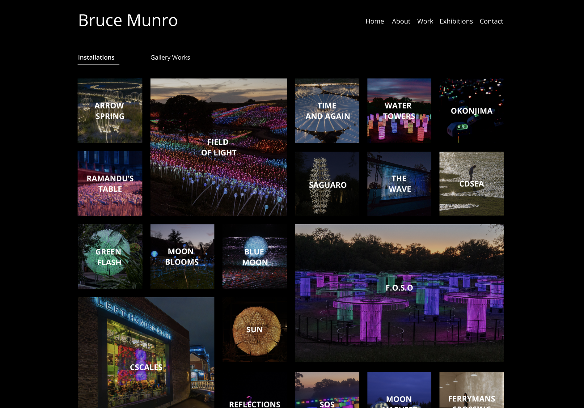
‘The Work pages grid is quite boring and none of the artworks really stand out, the images are quite small and there is now captions or text.’
AFTER

To accentuate some of the key artworks that the artist wants promote, key thumbnails are now larger to draw users to these. The larger pops of colour make the over page more interesting.
BEFORE

Accessibility tests raised an issue with the text weight and background. The typography is very light and with so many colours in the background, it gets lost.
AFTER

I revised the design by darkening the background further and changing the weight of the typography to bold. I also centred the text to ensure the users can view the titles clearly.
BEFORE

‘I really don’t like the different font sizes’
AFTER
I amended the fonts to be all the same size and weight. This translates more seamlessly to the mobile view.
user insight
Users liked the clean streamlined designs most, duplicating the fonts and layouts tested highly.
STAKEHOLDER feedback
Stakeholders feedback was extremely positive at this stage of the prototyping process. They loved the new UI and they agreed with the design decisions to remove unused areas and to add ticket links.
They asked for an additional page on the new ‘Work’ page to include past commissions which I will also add.
What new hypothesis do you have?
Users currently find viewing the artworks awkward as they cannot view the titles and key elements easily. By ensuring users can easily view the artworks at the exhibitions they will be more likely to be excited by the event and purchase tickets.
We know this to be true when users purchase more tickets and social media engagement grows.
How will these be validated?
These hypothesis will be validated by analysing website traffic and click through rate to the ticket sales forms. We can also monitor the enquiries that the studio receives on average, drawing more potential clients and art collectors to get in contact.
Whats next?
Add the new pages requested by the shareholders and polish iteration of prototype and usability test. Revise prototype for further ideating if required and prepare for handover to web development company.