Brew Hunt
A web application showcasing the best local brews and amazing discounts.
This web app not only makes for easy exploration of hidden gems near you but also has hundreds of discount codes and special offers to discover.

project overview

challenge
To design an app inspired by scavenger hunting and exploring. How can the app help users to discover new and exciting spots in a new place while incorporating a game element to keep users returning again and again.
process
Through initial hypothesis, user interviews, the development of user personas and user flows to low, mid and high fidelity wire framing and prototyping, I put my ideas through rigorous testing and critique to continue to iterate and develop an app that is accessible and enjoyable for its users.
My
ROLE
UX Designer
This was a solo project as part of my Career Foundry UX design course
timeline
4 months
tools
Sketch, Photoshop, Balsamiq, Invision, pen and paper

WHY THIS APP?
To find out whether there was a need for this app, I started by researching current products and hypothesising about what is missing in these existing experiences.
INITIAL HYPOTHESIS
When on a city break, users have limited time to discover the area and the place they are visiting. Providing users with interesting local facts and beverages to aid their discovery of the area will save time and enable them to see and experience the highlights of the city.
We know this to be true when we see how many users are engaging with the app in different locations all over the world.
To take advantage of deals and vouchers users currently have to purchase these via an app which they find to be a long and tedious process. By eliminating the need for in app offers and vouchers to be purchased and instead, having them redeemable by presenting to the relevant location. Users will not feel the need to organise their trip so rigidly and can enjoy a spontaneous exploration of the city with the advantage of knowing they can discover discounts along the way.
We know this to be true when users can the QR codes and reveal the discounts.
INITIAL RESEARCH
1. To better understand user behaviour when seeking local brews when visiting a new city.
2. To determine whether users would find the features of my app useful.
3. To better understand the context in which my user would use my app.
4. Discover users experiences with current apps, including pain points.
WHO AM I DESIGNING FOR?
Through research and user interaction I formulated three user personas which encompassed the broad target user for my product.
DOES IT ACTUALLY WORK?
Through testing low, mid and high fidelity wireframes over many months, I developed an understanding of users pain points, improving user flows and effective UI elements.
USER INSIGHTS
During early prototyping
‘Submit review button confusing! ‘
The floating CTA button was initially misleading, as users should not be able to leave a review without first confirming they have been to the bar.
Once the user had scanned the correct discount QR code, which could only be achieved when physically in the venue, they could then choose to submit a review. This was much more clear to the users during testing.
‘The different bar info runs in to each other’
In later iterations, I developed the full content of the bar information screen and added cards to separate and contain the information in sections so the amount of information was easier to navigate and digest.

USER INSIGHTS
During high fidelity prototyping
Before
After
Feedback
Analysis
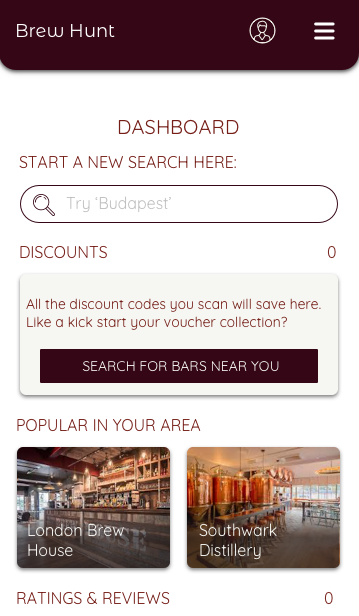
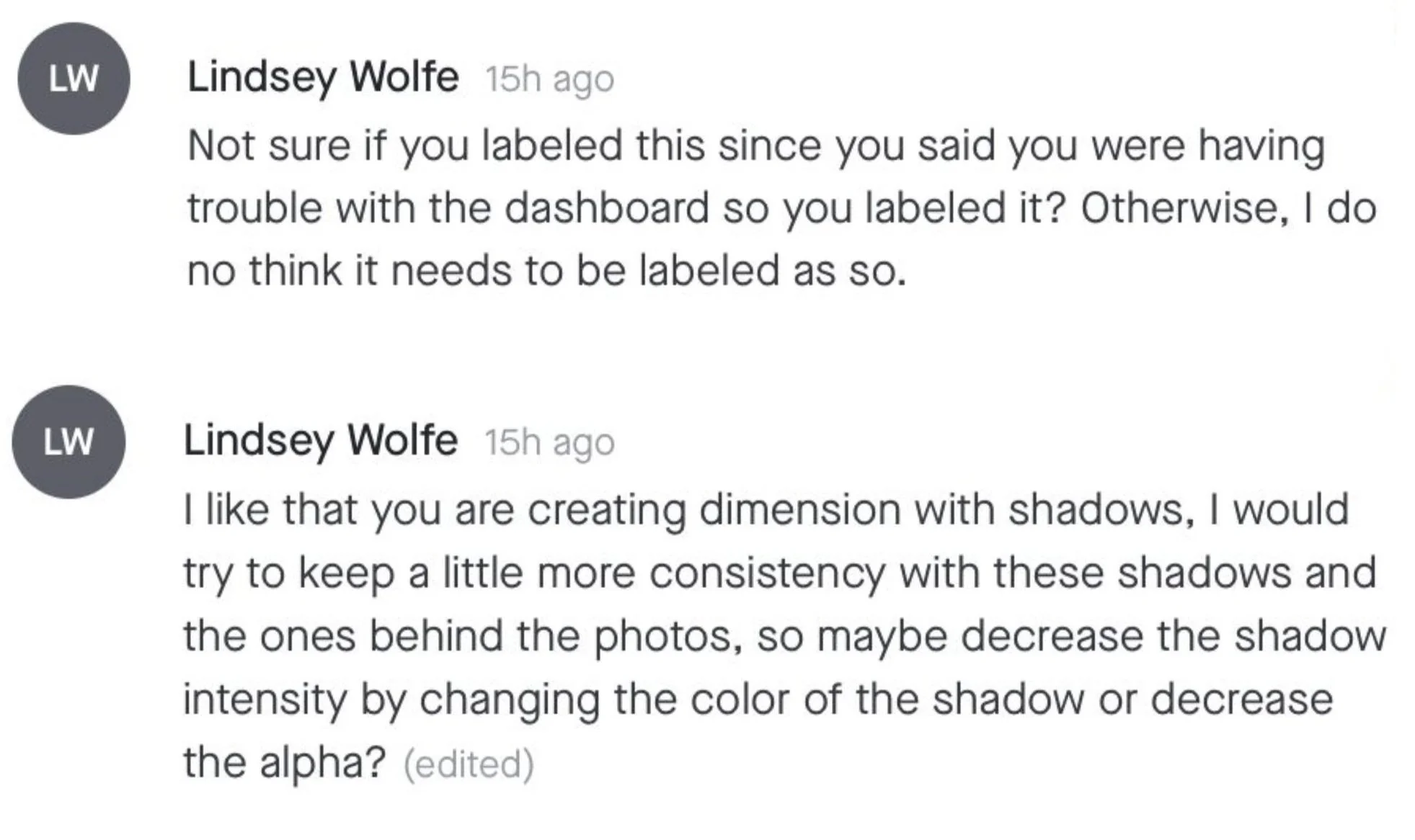
I agree with this feedback, the dashboard was something I asked my peers for feedback on, without the dashboard label the screen is more attractive. In my previous round of user testing the word dashboard also confused some, so this would also be a good way of avoiding more confusion.
I took the other feedback onboard but the images and text shadows have the same shadow intensity, this may appear differently due to the different content types. Instead a slightly blurred the shadow further to ease the intensity.
Before
After
Feedback
Analysis
I wanted to keep the design of this screen so have adjusted the width and position of the button to be consistent with the form above. I agree with Lindsey in that it feels disjointed and think it fits together now as a screen.
Before
After
Feedback
Analysis
I also agreed with this feedback and redesigned the bar information cards.

the product
Get Started
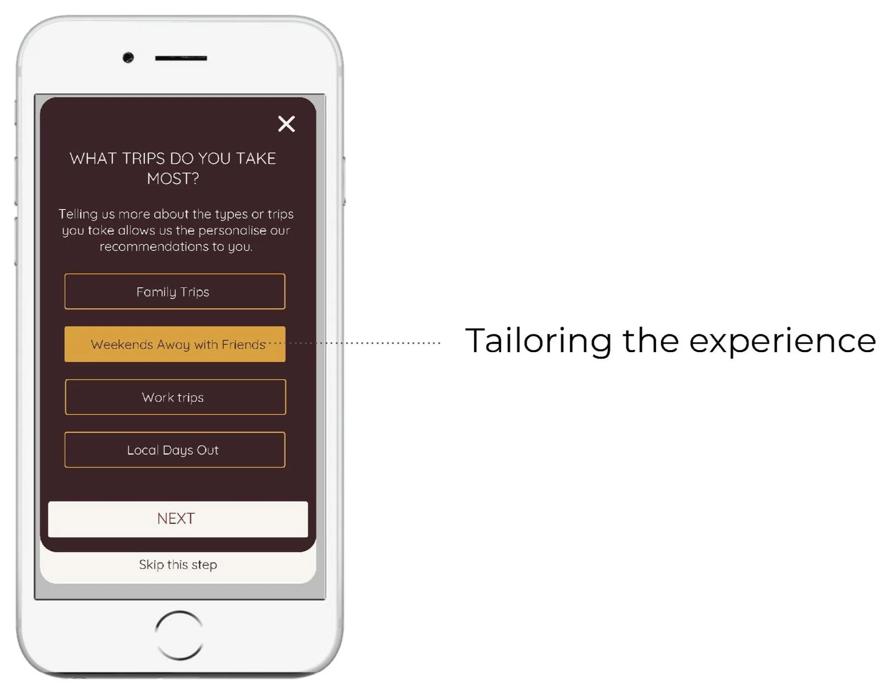
Onboarding allows the app to make more targeted recommendations to the new user to improve their experience but more efficiently finding the product that they desire.
explore
The app welcomes users to explore bars near their location while also recommending highly rated hidden gems with the biggest discounts.
Unredeemed discounts, popular choices in your area and inspiration are displayed on the dashboard for ease.
search
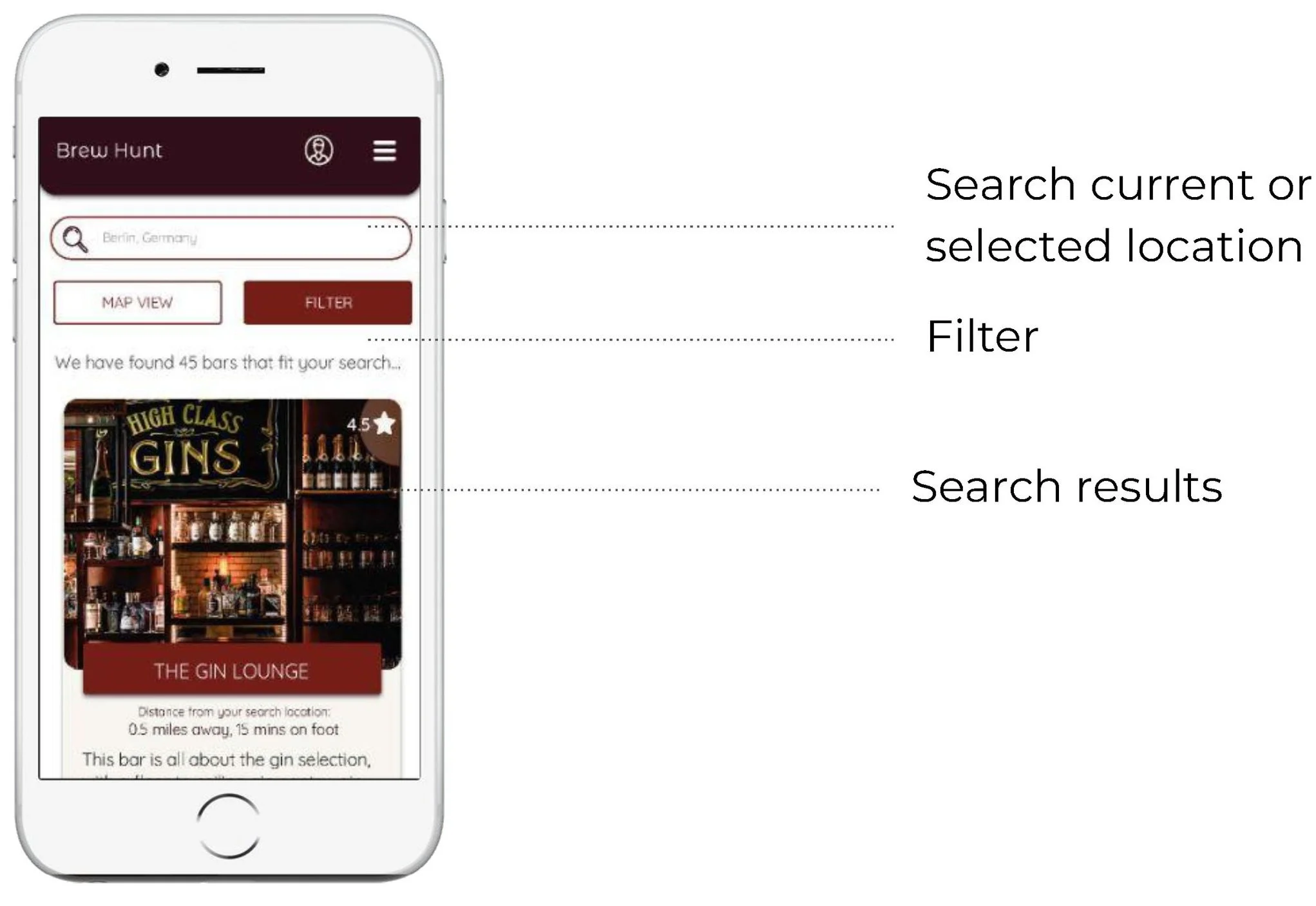
Users can search for their ideal spot based on their interests, requirements or distance they want to travel.
More targeted features such as dog friendly or budget specific offers additional information that other apps do not include.
discover
Users are prompted to scan QR codes and discover amazing discounts unique to the app. Discounts around new craft beers or cocktails in sampling phase creates an exciting scavenger feel to the ‘Hunt’ element of the app.

What new hypothesis do you have?
Users currently find searching for the best bars awkward when using their smartphones remotely, as often they cannot filter through the specific options they want. By ensuring users can search through a wide range of filtering options, users can find local bars easily to their specific needs and requirements.
We know this to be true when users are returning to use the app and the user base is found to be growing gradually.
How will these be validated?
These hypothesis might be validated through further user testing in an active scenario. When the product is in the mid to final stages of development the team would start to reach out to bars who might be interested in being promoted through the app. This further testing could take place in one of these bars to streamline the process and ensure there are no technical issues. During this testing the users would be asked for feedback on their experience. Focus groups could also be used in this way.
Are there any areas in need of specific improvement?
I think that the dashboard and bar information page in particular could be improved, currently they have only been tested by a small demographic of people and I would like to extend this testing to others outside the UX student community who might bring valuable insights to whether this UI is successful and suggestions for improvements.


