

Language Booth
A flash card app to aid learning a new language.

project overview
challenge
To design low fidelity wireframes of an app to help users new a language
process
Gain an insight into current products through interviews, user flows and personas. Use these insights to build low fidelity wireframes to usability test an iterate design.
My
ROLE
UX Designer
This was a solo project at the very start of my UX design course
timeline
3 weeks
tools
Adobe Photoshop and Pen and paper
WHY THIS APP?
I research current products on the market to find out what users think of the offerings and ascertain whether there is a new for a new flash card app.
INITIAL USER RESEARCH
1. To discover how successful competitor apps are
2. To learn how/ when/ where users use these apps to learn a language
3. To discover users pain points
4. To consider what these interviewees are doing, thinking and feeling

Leanne, 30
Ecologist
Speaks English
Has been inspired to learn a new language recently after a trip to Poland.

Doing
I tried to find different ways of learning a new language and thought YouTube was good to hear the pronunciation of the words. I studied at home because the YouTube videos were not effective on a tiny phone screen. I did not want to pay for an audio book or app.
thinking
I think people should make the effort to learn basic phrases in the language of the country you are visiting. I think I struggled because there was no support or interactivity in my learning. I think when I am in the country, I am surrounded by the new language so am immersed in it. I think this is the best way of learning. “If I don’t use it (the language) I will not remember it.”
feeling
I got bored and annoyed when the vocabulary was too hard. I felt frustrated with the structure of the YouTube videos which meant I got bored quickly. “I did not feel confident in what I had learnt.”
WHO AM I DESIGNING FOR?
To apply the insights I have been able to gather from my research so far, I created a proto-persona. This informed a problem statement and hypothesis.

• 31 years old, living in a small town on the edge of Bath, UK
• Marketing assistant who works full time in an office, occasionally has to travel for work.
• Married with one child
• Loves the outdoors and travelling.
“When travelling to different countries I think it is important to immerse yourself in the culture and language to fully experience it.”

Problem Statement
Natalie needs a way to learn a new language that allows her to compare and challenge her friends interactively as this would motivate her to keep active in her studying.
hypothesis statement
We believe that by creating a flashcard app that focuses on reiterative learning through visual and interactive games and competitions for Natalie, she will engage daily with the flashcard app and therefore commit more vocabulary to memory.
DOES IT ACTUALLY WORK?
Test low fidelity wireframes for usability pain points to improve user flow and interaction with the app.
USER INSIGHTS
During early prototyping
“What is a dashboard? Do I have to find out for myself?” “I think there should be a clearer and more in depth tutorial about each of the sections. I think this should include an explanation of what the dashboard is.”
An additional explanation screen is required to explain the dashboard set up within the on boarding. Dashboard also needs to be labelled or more clearly identifiable.
“Where am I sending the quiz? It seems simple to use and is quite self explanatory apart from the send button at the end of the quiz. I did not understand what I was sending.”
Issue with back button has been found within testing and requires redesigning.
Also need to change location of start and end challenge in quiz mode.
prototyping
Iterating low fidelity prototypes led by user insights
Feedback
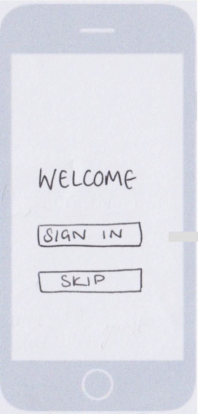
Users found flow in the on-boarding is confusing.
Once signed in, tutorial starts immediately. Users found this confusing and some thought it was the main page.


Improvements
Added a screens to inform users that they can start a tutorial with option to skip altogether. Also blurred/distorted background so that users can focus on content.
Notes for further iterations (added in hindsight)
Remove ‘Continue as guest’ and replace with ‘Try for free’ to enable users to get a feel for the app and consider whether it is something they will pay for, knowing that this is a temporary feature. The app would ask to collect data from them for promotional reasons.
Before
Feedback
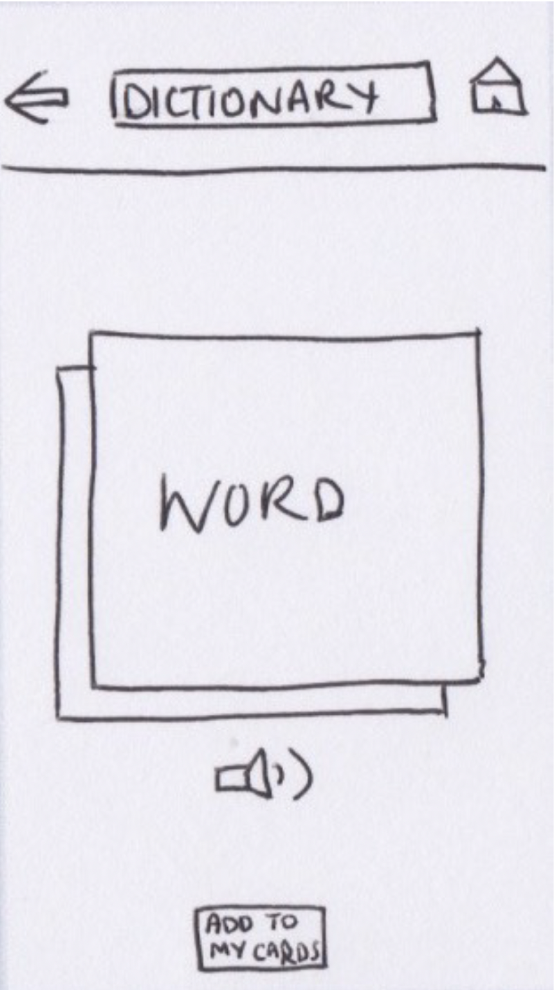
Dictionary does not include definitions.
Users need an option to view definitions to check they are learning the correct word.
After


Improvements
Clear definition in English button added, keeping ability to flip the flashcard and reiterate learning.
Add to my cards larger button, to enable users to quickly tap and save words they need to work on.
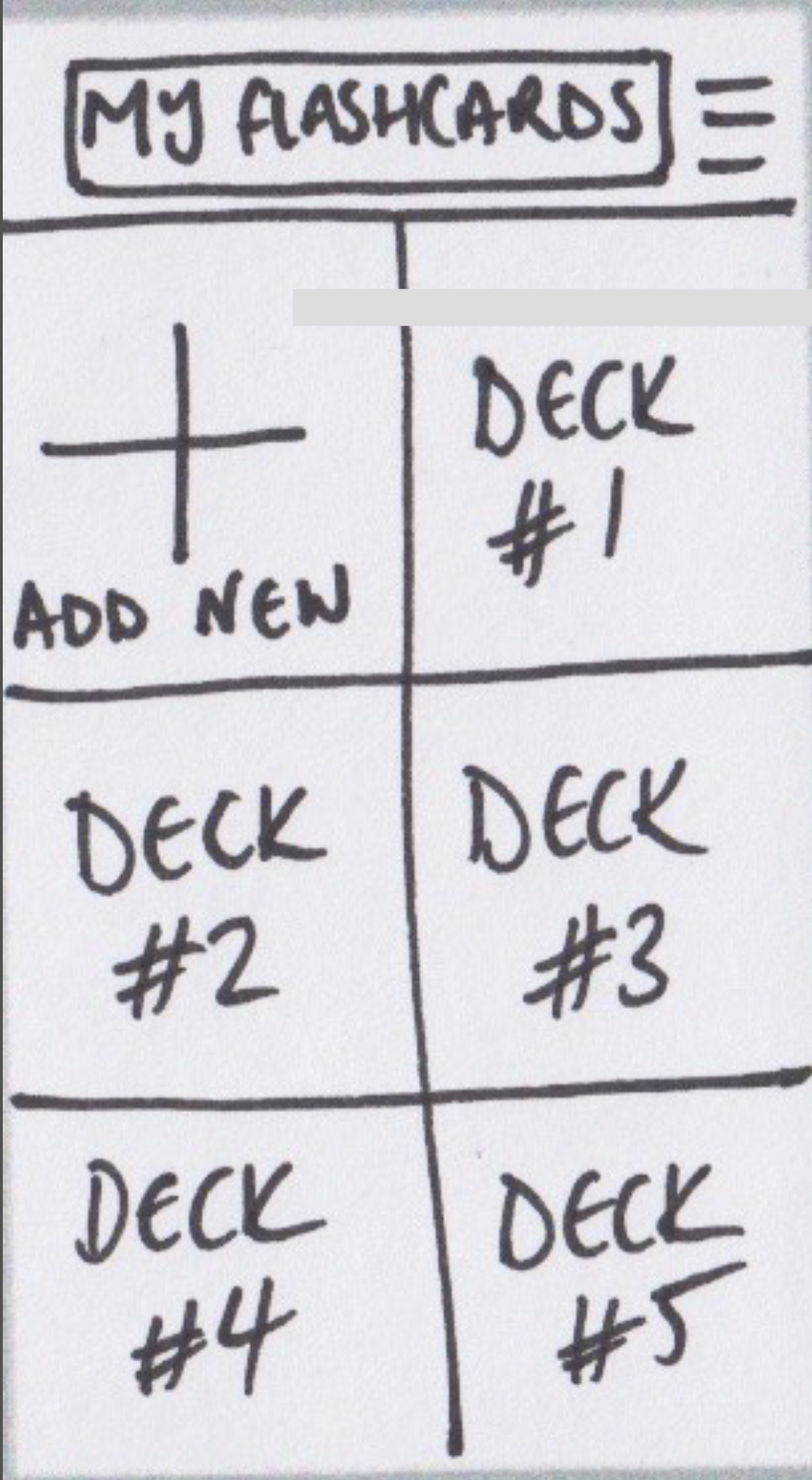
Before
Feedback
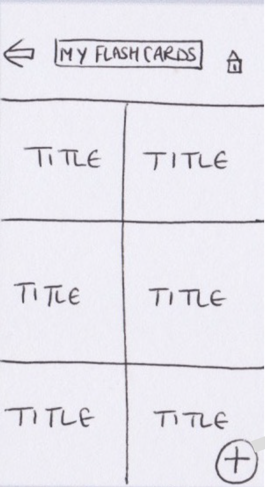
Flashcards add new button hard to find.
User found adding a flashcard confusing. The Add (‘+’) button is too small and hidden in the corner. Having the example decks named ‘title’ is also not clear that they are decks of flashcards previously made.
After
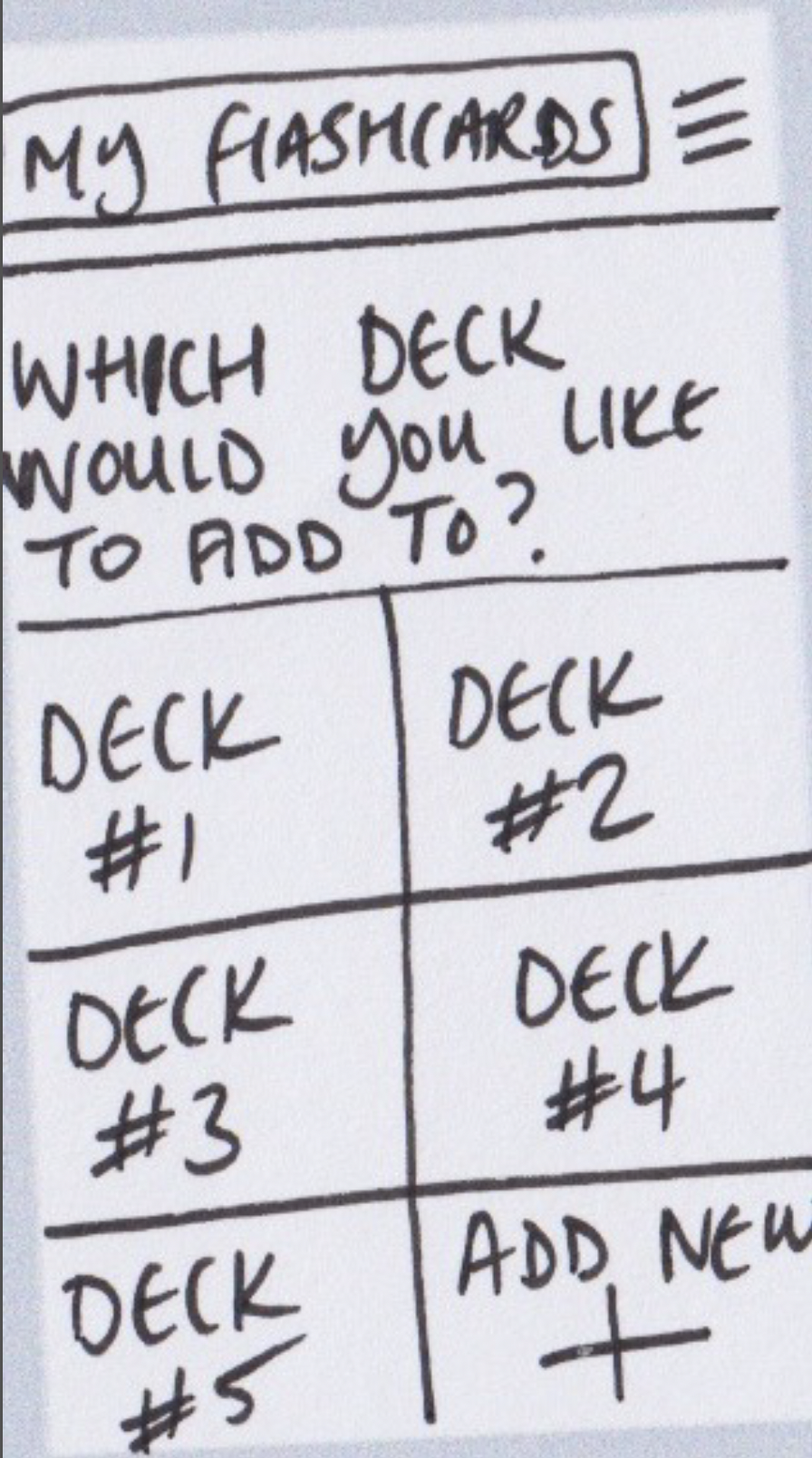
Improvements
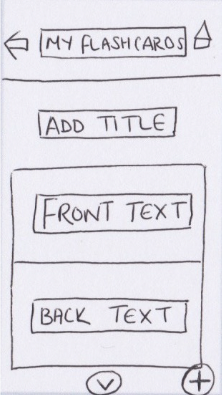
Changed add button the larger integrated square and moved it to the first section the users see at the top of the screen.
Renamed flashcard groups ‘decks’ to illustrate to the users that they can create their own decks.
LEARNINGS
As this was my first UX project the learnings were vast. It highlighted the fundamentals of the UX design process and started my journey. At the time I noted that the following learnings to be important:
Do not assume anything about the users.
Do not over complicate the layout and arrangement of buttons.
Focus on the easiest and most simple path to complete a task before designing layout.
Give users clear direction.
What’s next?
This project is still in its infancy, development into mid and high fidelity wireframes will enable more productive user testing as it is always challenging to test low fidelity wireframes.